Past and Present: Japanese National Soccer Team World Cup Uniforms
Newsfrom Japan
Sports- English
- 日本語
- 简体字
- 繁體字
- Français
- Español
- العربية
- Русский
Origami Symbolizes Hope
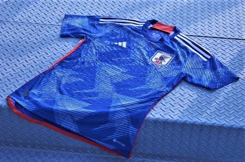
The Japan Football Association recently unveiled the new uniforms of the national soccer teams, which the men’s squad will sport at the FIFA World Cup in Qatar. The kit, revamped for the first time in three years, made its debut in a friendly match in Germany against the United States on September 23, 2022.
The core concept of the uniform is origami, the Japanese art of paper folding. The inspiration for incorporating aspects of the ancient technique dates back to the final of the 2002 FIFA World Cup, jointly hosted by Japan and South Korea. At the end of the match, some 3 million orizuru, origami paper cranes, fluttered in the air at International Stadium Yokohama (now Nissan Stadium) to congratulate the winning team.
Origami as a symbol of prayer delivers both joy and victory. In addition, the peaks and valleys of folded paper reflect the highs and lows that the Japanese team has seen as it has evolved over the years.

The 2022 national team uniform is designed by Adidas and worn by the Japanese men’s and women’s squads for home games.
The home game uniform, as is traditional, is based around blue. The front of the jersey features an origami image showing the lines and steps for folding. A key change from earlier uniforms is the placement of the Japanese flag. Previously included above the team emblem on the left breast, it has been moved to the back of the jersey between the shoulders. Adidas Japan explained the intention was to represent the responsibility shouldered by the team for Japan and to express the backing of supporters.
Players’ numbers have also been changed from white to yellow to enhance visibility on television and smartphones.

The uniforms sport a number of changes, including a red panel inside the collar, which was adopted from the uniforms worn by the team when it won the 2011 AFC Asian Cup in Qatar with the hope that Japan can achieve similar success.
The uniform for away games comprises a white jersey and, for the first time, black shorts. Like the home game uniform, it features an anaglyph origami design, predominately on the sleeves, superimposing red on blue for a 3-D effect.

Japan’s away kit features a multi-layer origami design.
When asked about the new uniform, midfielder Minamino Takumi said he was “proud to battle it out on the pitch wearing Japanese blue,” adding that the design spurred the players to give it their all.
Teammate Asano Takuma praises the use of origami in the uniform’s design. Recalling how in high school he received a chain of folded cranes from the school’s alumni to bring good luck in the national tournament, he says that he believes in the power of origami. “It embodies the hopes of the folder,” he declares. “I look forward to playing while enveloped in that energy.” He says the design brings home the long tradition and legacy of the team. “It motivates me to do everything possible to help the team win.”

Minamino Takumi shows off the new national team uniform.
Looking Back at Past Uniforms
The men’s national team is known as Samurai Blue for the color of its uniform. Although the moniker is a relatively new invention, the squad has sported blue kits stretching back some 90 years.
Japan’s first foray into the World Cup was in France in 1998. The uniform the team wore for the tournament was designed by Japanese firm Asics. In 1999, the JFA signed a contract with sportwear giant Adidas, who has supplied the team’s uniforms for every campaign since the 2002 World Cup.
1998 FIFA World Cup France (result: knocked out in group stage)
The kit was nicknamed the flame uniform after the design adorning the sleeves resembling the flames shown behind the Buddhist deity Fudō Myōō.

Nakata Hidetoshi sporting the Asics-designed uniform at the 1998 World Cup. (© Kyōdō)
2002 FIFA World Cup Korea/Japan (result: Round of 16)
Concept: Mount Fuji
The simple design was intended to express Japanese beauty. The piping extending along both sleeves from the neck represented Mount Fuji reflected on a lake surface.

The “Mount Fuji” uniform for the 2002 World Cup.
2006 FIFA World Cup in Germany (result: knocked out in group stage)
Concept: sword temper pattern
This design encapsulates the traditions and technology of Japanese swords, inspired by Samurai Blue, a term coined for the Japanese team. It features a wavy temper pattern as appears on a Japanese sword blade, set against the deep blue of the seas that surround Japan, soaring up to the light blue of the skies, representing the world.

The “sword-temper pattern” uniform for the 2006 World Cup.
2010 FIFA World Cup in South Africa (result: round of 16)
Concept: wings of revolution
This design incorporated “wings of revolution,” based on the hopes of team manager Okada Takeshi that Japan would make it to the semifinals. The jersey front is inspired by the wings of yatagarasu, a three-legged raven from Japanese mythology that appears on the JFA emblem. The red patch on the neck was also striking. The team had two jerseys to choose from, suited to different pitches and styles of play.

The “wings of revolution” uniform for the 2010 World Cup.
2014 FIFA World Cup in Brazil (result: knocked out in group stage)
Concept: circular formation
This uniform’s design was based on the concept of a circular formation comprising both players and supporters. The rear features a single neon-colored line, representing the giant circle formed when the team members join forces with their supporters. Eleven lines radiate from the emblem on the breast, denoting the team members spreading across the field for action.

The “circular formation” uniform for the 2014 World Cup
2018 FIFA World Cup in Russia (result: round of 16)
Concept: winning colors
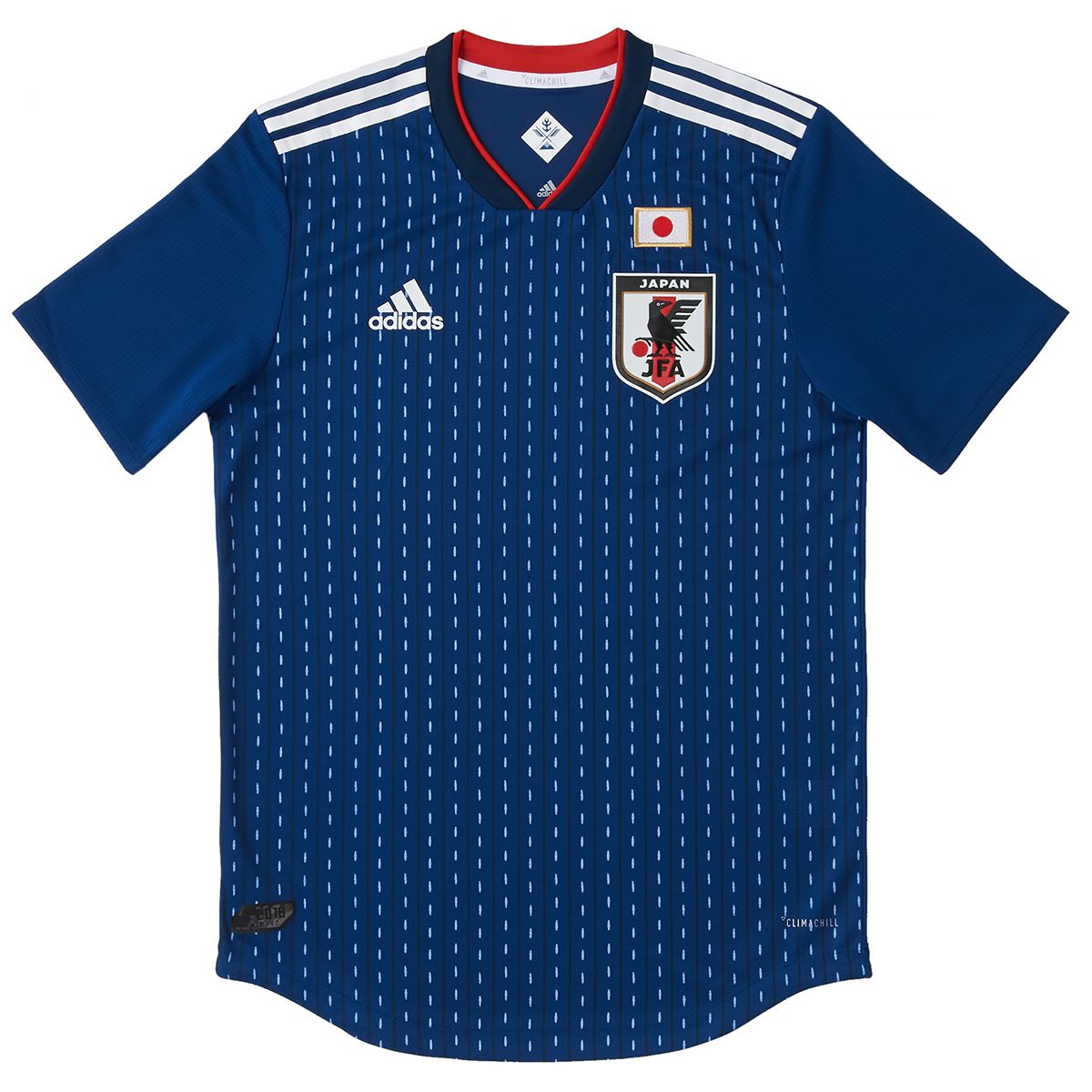
This uniform saw a return to the original “Japan Blue,” a traditional indigo blue representing victory. The design is based on quilting stitches, binding the aspirations of the players, staff, and supporters who have built the legacy of Japanese soccer in the hope of inspire the team in the Russian tournament. The V-neck evokes the front of samurai dress, embossed with the red of victory from the Japanese flag.

The “winning colors” uniform from the 2018 World Cup.
Other Uniforms: Kumamon
At the time of the World Cup in Russia, the JFA presented a team jersey to Kumamon, the mascot of Kumamoto Prefecture, popular both in Japan and abroad. The jersey number 55 was taken from Kumamon’s Twitter handle.

Kumamon, joined by soccer officials from Kumamoto shows off his Japanese team jersey on May 17, 2018, at the Kumamoto Prefectural Office. (© Jiji)
Other Uniforms: Sky Collage
Adidas Japan has fashioned other uniforms aside from those worn at World Cups, with the aim of giving the team the best in design and functionality.
One example is the 2020–21 uniform that evoked the color of Japan’s clear blue skies. It evolved from the concept of the sky linking together the players and supporters viewing it from all directions, with a “sky collage” of five shades of blue, in a cloudless sky. The back of the jersey was a single shade of sky blue.

Forward Kubo Takefusa shows off the “sky collage” uniform worn by the team at the Tokyo Olympics. Borrowing from by motifs found in Japanese traditional woodblock prints, it created a stir among fans.
(Originally written in Japanese. Reporting and text by Nippon.com. Banner photo: The Japanese national team poses in their “origami” uniforms before a friendly match against the United States on September 23, 2022, in Düsseldorf, Germany. © Jiji. All photos © Adidas Japan except where otherwise noted.)
